Monday, 25 October 2010

Changing Emotion Animation

This animation is inspired by a boy I saw leaning on railings, looking over into the sea at Falmouth Docks- on the phone, who was very expressive through his body movements. I sketched him for Cathy's brief to sketch people in conversations, and from that carried on animating and produced this;


Overall I am satisfied with the timing of the animation but think some parts the boy's movements 'pop' too much, like the part his back moves too fast between frames and at the end he seems to shrink. Altogether there are 288 frames derived from 36. I found it useful going back frames, using the same ones twice in reverse, to move him into other poses and positions from the ones like moving his leg.

Monday, 18 October 2010

Character Walk Cycle

For my character walk cycle I wanted to imitate a lady i'm close to who comes into Costa where I work at least x2 a day for several hours and is extremley dependant on us, if slightly insane. I asked if I could film her walk and she agreed.

Here are the results;


From that video I derrived 11 frames and initially the following walk cycle:


I continued to play around with the frames till I felt they looked right:

Saturday, 16 October 2010

Crafting the carousel.

I looked round Falmouth Town today for things I could use to make the carousel. I was amazed what I found in Trego Mill's kitchen & home baking section. I bought;
  • 3 deep cook metallic dishes; for the roof and base of the carousel,
  • 1 kitchen roll dispenser; for the central pole of the carousel,
  • white base acrylic paint- as a base to decorate over,
  • white kitchen food netting cover- to use as a drape/curtain I thought would look nice,
  • glue gun so I have a clean fix.


Unfortunately the acrylic paint did not take to the metallic or wood as thick as I would have liked, so I plan to paper mache over them first, then paint over to create a thicker, bolder finish.


Friday, 15 October 2010

Prototype card/tape carousel.

This is a prototype carousel I made from my flat mate's shoe box and tape.
I wanted to have something physical to look at and analyze to get a sense of the balance of the carousel and structure.


The curved roof is too small for the top but I will make it bigger on developing the design. It all balances out really well (surprisingly) and I think I could develop and animate really easily this basic design. Now I need to decide what material to use to craft the carousel with. I'm thinking wood would be ideal in terms of remaining firm and sturdy throughout animating- but I'm not a carpenter, neither have appropriate tools, or use of. So I might have to settle for very strong card and tape.

Thursday, 14 October 2010

Carousel brain storming.

Here are some initial ideas for the Carousel;


I was deciding after looking at pictures of real life and toy carousels to base mine on a more toy-looking carousel which are more basic. I think if I have things animating on the carousel stage it is important to have quite a simple/pretty/basic set so the effort I put into animating isn't wasted because attention is directed more towards the background. Moreover, to make sure the audience aren't visually misdirected from any animation I will probably have the carousel spinning for a few seconds to the music so the scene is set momentarily before any real action or ideas come into play.

I was contemplating wether to make the carousel round or pentagon or hexagon. I've decided on a circular carousel as on investigation that is what shape real-life ones are, and I only thought of using angled edges to calculate number of turns in animating but instead I will put clock style markers so I can turn the carousel a equal rotation each time.

Carousel Photos.

This first picture I found on google images I thought is a good break down of what 2 basic elements my carousel should be;
  1. Initial central pole skeleton to hold up the rotating elements of the structure,
  2. Rotating base and roof connected via supporting poles.
I thought this was a interesting angle to look at the carousel- not from the p.o.v of the girl, but traditional architecture (such as a carousel) with a modern/experimental/simplified/art deco take.
This is a grand, real-life, fair ground carousel. I think this is too complex to use and the base stage for a animation and there's too much visual noise and beautiful but complex and distracting detail.

This is a wind up carousel I have which plays music from a music box underneath. I like the idea of music box style audio to this particular animation- I may try and sample some music box style sounds into the edit.

Wednesday, 13 October 2010

Initial Ideas - Experimental Animation

For my experimental animation I think I've settled on the 'Oam_s_Blues-C' track as Derek advised our animation steer away from having a particular meaning or story line and I feel this is quite a versatile and quirky tune.

On the basis of not having a story line; I thought through what visuals don't relate to having structure or hold particularly renowned symbolism. I thought of a constant, flowing movement and appearing and changing images. I then thought what would aesthetically look decorative and artistic - seeing as what the animation looks like is really important to me to get across my personal style. I thought then of a fair ground carousel- constantly turning, not progressing in any way, steady and flowing.

I think within the boundaries of a carousel there are great possibilities. I thought of other experimental animations I've seen and one we watched in class called 'Dot' which is the latest Aardman animation:


This hands on stop-motion, hand-crafted approach with touches or real life objects e.g the bee and needles, made me think of making my own stage/props. I've decided through combining all these ideas to set the bar high and hand craft my own carousel to animate too. I'm trying to be optimistic but at the same time think this will be a huge challenge but I like to push myself creatively and I know I will learn a lot from it.

Monday, 11 October 2010

Lifting Weight

This is my weight lifting animation.


This is originally 20 frames but some I repeated for anticipation and actions like the shudders at peak lifting state. I had to add a few extra frames after watching the finished animation back for the 'step back' part just of the leg mid-action.

I chose a simple character just for principle it's a basic weight lift and to use a complex character would take away from the brief and isn't really necessary.

I'm pleased with the general flow of the movement but to improve it would add more frames between possibly to create a smoother finish. Also clean some of the lines up.

Sunday, 10 October 2010

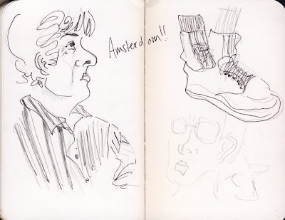
Europe Sketch Book

These are scans of my sketch book I took around Europe with me for a month over Summer. I can really notice a improvement in my work towards the end of the book.