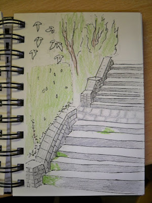
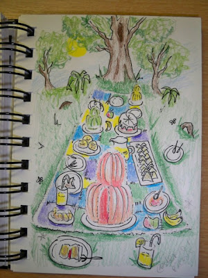
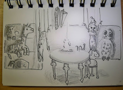
Here are some sketches I did a few weeks ago as ideas for my background design project.


The first one i've decided to scrap and change to something more organic like possible a monochrome tree landscape.
The other 2 I'm happy with as rough sketch ideas, but with advice from my teacher Kathy, have realized they need more depth to them. This is what I couldn't work out why they didn't look right.
I'm now going to use my A3 pad and draw them up to scale of how the final pieces will be.
The other 2 I'm happy with as rough sketch ideas, but with advice from my teacher Kathy, have realized they need more depth to them. This is what I couldn't work out why they didn't look right.
I'm now going to use my A3 pad and draw them up to scale of how the final pieces will be.

No comments:
Post a Comment